Scalable Vector Graphics (SVG)
Introduction
SVG stands for Scalable Vector Graphics. It is an XML language, which can be used to draw vector graphics. Because this is an XML language, all tags must be closed.
| Displayed by browser | HTML markup required |
|---|---|
|
- We start by using the
<svg>root element to specify that we're writing an SVG image. - Then we use the
viewBoxattribute that defines the coordinate system for the SVG canvas and allows the SVG to scale dynamically without losing proportions<svg viewBox="minX minY width height">:- minX minY â Is the top-left corner of the coordinate system.
- width height â Defines the coordinate space inside the SVG.
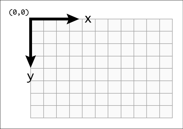
<svg viewBox="0 0 200 100">, starts at (0,0) in the top-left, has a width of 200 units and height of 100 units.
The preserveAspectRatio attribute controls how the SVG content scales and aligns when the aspect ratio of the viewport does not match the aspect ratio of the viewBox.
- xMidYMid â Centers the content both horizontally and vertically.
- meet â Ensures the entire content fits inside the viewport, keeping the aspect ratio intact.
The viewBox is important because:
- It makes SVG Responsive â Scales the drawing proportionally when resizing the browser.
- It removes the Need for Fixed Width/Height â The SVG adapts to different screen sizes.
- it allows Zooming & Panning â You can control which part of the SVG is visible.
- The
<rect>element defines a rectangle. In our example, we've defined that the reactangle is taking the full height and width of the image by specifyingheight="100%"andwidth="100%", so we do not need to specify the coordinates of the rectangle. The rectangle is filled with lavender colour. - We then draw a circle of 45 pixels radius using the
<circle>element andrattribute, the center coordinates of the circle being 100 pixels to the right, and 50 pixels to the left of the top left corner of the image, see Figure 1, using thecxandcyattributes. The circle is filled with purple colour. - Finally, we draw text "SVG" at position (100,60) from the top left corner of the image, and align that position to be the centre of the text (
text-anchor="middle"), and specify the font-size to be 30. The text is specified between the opening and closing text tags.
Basic Shapes
There are some pre-defined basic SVG Shapes, which can be drawn to the screen. When drawing on the screen, it is possible to specify the stroke as follows:
| Attribute | Meaning |
|---|---|
fill | The color inside the drawn object |
stroke | The colour of the line drawn around the drawn object |
stroke-width | The width of the stroke |
Rectangle
The <rect> element is used to draw a rectangle.
| Displayed by browser | HTML markup required |
|---|---|
|
The attributes used above are:
| Attribute | Meaning |
|---|---|
x | The x position of the top left corner of the rectangle |
y | The y position of the top left corner of the rectangle |
width | The width of the rectangle |
height | The height of the rectangle |
rx | The x radius of the corners of the rectangle |
ry | The y radius of the corners of the rectangle |
Circle
The <circle> element is used to draw a circle.
| Displayed by browser | HTML markup required |
|---|---|
|
The attributes used above are:
| Attribute | Meaning |
|---|---|
cx | The x position of the center of the circle |
cy | The y position of the center of the circle |
r | The radius of the circle |
Ellipse
The <ellipse> element is used to draw an ellipse.
| Displayed by browser | HTML markup required |
|---|---|
|
The attributes used above are:
| Attribute | Meaning |
|---|---|
cx | The x position of the center of the ellipse |
cy | The y position of the center of the ellipse |
rx | The x radius of the corners of the ellipse |
ry | The y radius of the corners of the ellipse |
Line
The <line> element is used to draw a straight line between two points.
| Displayed by browser | HTML markup required |
|---|---|
|
The attributes used above are:
| Attribute | Meaning |
|---|---|
x1 | The x position of the starting point of the line |
y1 | The y position of the starting point of the line |
x2 | The x position of the ending point of the line |
y2 | The y position of the ending point of the line |
Polyline
The <polyline> element is used to draw a series of straight lines.
| Displayed by browser | HTML markup required |
|---|---|
|
The attributes used above are:
| Attribute | Meaning |
|---|---|
points | A list of points, each number separated by a space, comma, EOL, or a line feed character. Each point must contain two numbers, an x coordinate and a y coordinate. So the list (0,0), (1,1) and (2,2) could be written: "0 0, 1 1, 2 2" or "0,0 1,1 2,2". |
Polygon
The <polygon> element is used to draw a polygon, which consists of a series of straight lines segments, where the path automatically retirns to the first point to close the shape.
| Displayed by browser | HTML markup required |
|---|---|
|
The attributes used above are:
| Attribute | Meaning |
|---|---|
points | A list of points, each number separated by a space, comma, EOL, or a line feed character. Each point must contain two numbers, an x coordinate and a y coordinate. So the list (0,0), (1,1) and (2,2) could be written: "0 0, 1 1, 2 2" or "0,0 1,1 2,2". The drawing then closes the path, so a final straight line would be drawn from (2,2) to (0,0). |
Path
The <path> element is used to draw a path. This is the most powerful and used element in SVG to draw images as it allows to draw curves, arcs, etc. Drawing paths in XML is not recommended as this can become very complex, however understanding how path works is useful.
| Displayed by browser | HTML markup required |
|---|---|
|
The attributes used above are:
| Attribute | Meaning |
|---|---|
d | A list of points and other information about how to draw the path. The commands in d can include the following:
|
Adding CSS
SVGs can also be styled using CSS. You can use any svg element as CSS selector. You can also add classes and ids if this is more convienient.
| Displayed by browser | HTML markup required |
|---|---|
CSS: |
Grouping elements
The g element can be used to group other svg elements together. This can be very handy when you want to apply transformation or behaviour to a group of SVG elements using either CSS or JavaScript.
In the example below, the grouping is used to translate the whole drawing away from the edge of the SVG by 10 pixels horizontally and vertically, so the drawing don't get truncated. The CSS also makes use of the grouping, so that when the user hovers over the group with the id group1, the stroke colour of the cicle, ellipses and path turn red, and the ellipses also get a red fill.
| Displayed by browser | HTML markup required |
|---|---|
CSS: |
In the example below, the grouping is used to add some CSS effect on hover and to add some JavaScript event listeners that will change the page location on click.
| Displayed by browser | HTML markup required |
|---|---|
CSS: |
Using SVG in HTML
Different Ways to Call an SVG in an HTML Page
SVGs can be used in HTML in multiple ways depending on **use case, flexibility, and performance**. Below are the most common methods:
① Inline SVG (Directly in HTML)
Best for: Full control over styling, animations, and accessibility.
<svg width="100" height="100" viewBox="0 0 100 100">
<circle cx="50" cy="50" r="40" fill="blue" />
</svg>
② Using <img> Tag
Best for: Simple static SVG images.
<img src="image.svg" alt="SVG Example" width="100" height="100">③ Using <object> Tag
Best for: SVGs that need to be interactive but not inline.
<object type="image/svg+xml" data="image.svg" width="100" height="100"></object>④ Using <iframe>
Best for: Complex SVGs with animations or scripts.
<iframe src="image.svg" width="100" height="100"></iframe>⑤ Using <use> (Referencing External SVGs)
Best for: Reusing SVG elements multiple times.
<svg width="100" height="100">
<use href="icons.svg#icon-star"></use>
</svg>
⑥ Using CSS background-image
Best for: Decorative background SVGs.
.button {
width: 100px;
height: 100px;
background-image: url("image.svg");
background-size: contain;
}
Comparison of SVG Usage Methods
| Method | Best For | Can Style with CSS? | Interactive? | Needs Extra Request? |
|---|---|---|---|---|
Inline <svg> |
Customizable graphics | Yes | Yes | No |
<img> tag |
Static images | No | No | Yes |
<object> tag |
Complex SVGs | Inside file only | Yes | Yes |
<iframe> tag |
Isolated SVGs | No | Yes | Yes |
<use> in <svg> |
Reusable icons | Yes | Yes | Yes |
CSS background-image |
Decorative backgrounds | No | No | Yes |
Best Practices
- â Use inline SVG if you need styling or JavaScript interactivity.
- â Use
<img>for simple SVGs where styling isn't needed. - â Use
<use>for reusable icons (logos, UI elements). - â Use
<object>if the SVG contains animations or scripts. - â Use CSS
background-imagefor non-interactive SVGs.
Modern SVG Features in HTML5
SVG ForeignObject
SVG <foreignObject></foreignObject>: Allows embedding HTML elements within an SVG document. Useful for mixing text, images, and interactive content.
| Displayed by browser | HTML markup required |
|---|---|
HTML:
|
SVG defs & use
SVG <use></use> for Reusability: The
| Displayed by browser | HTML markup required |
|---|---|
HTML:
|
Limitations of use
Unlike normal elements, a <use> copy inherits styles from the original definition. Some browsers ignore direct CSS styling on <use> elements. A smart way to control colors dynamically while still using <use> is to combine it with CSS variables, like in teh following example:
| Displayed by browser | HTML markup required |
|---|---|
HTML:
|
Improved Accessibility for SVG
ARIA for SVG
ARIA roles and <title>, <des> elements: Ensure accessibility by adding meaningful labels and descriptions.
| Displayed by browser | HTML markup required |
|---|---|
HTML:
|
Add tabindex for SVG
SVG elements are not natively focusable, meaning you cannot navigate them using the keyboard unless you explicitly add <tabindex="0">. The <tabindex> attribute is used to control the keyboard navigability of elements in both HTML and SVG. It allows elements to receive focus, making them accessible using the Tab key.
How tabindex Works
- Elements with
<tabindex="0">are focusable in natural document order. - Elements with
<tabindex="-1">are focusable via JavaScript but not keyboard navigable. - Elements with
<tabindex="1">or higher define a specific tab order (not recommended for accessibility).
Here is an example:
|
When pressing Tab, the focus moves from the button to the div.
Have a look at an example that integrates svg buttons and uses <tabindex> to navigate to different buttons. This example uses also JavaScript to change the colour of the selected buttons.
Students and Staff Examples
|
A cat by Anne-Gaelle Colom - 2018 See what happens when your mouse goes over the cat |
A Penguin by Denisa Bercuci - 2018 |
| A Dog by Trevor Uchkach - 2018 |
Yoda - by Avinesh Sudhakaran 2020 |