Styling & CSS
Styling Links
Link pseudo-classes - you can also style links differently depending on what state they are in. There are four states:Need the order â link-visited-hover-active.a:link {}- Defines style for unvisited linksa:visited {}- Defines style for visited linksa:hover {}- Style for hovered links (mouse over)a:active {}- Defines style for active links (moment clicked)
a:link { color: green; }
a:visited { color: aqua; }
a:hover { color: blue; }
a:active { color: red; }a { text-decoration: none; }a:hover { color: blue; background-color: magenta; }<!doctype html>
<html>
<head>
<title>An Introduction to Style Sheets</title>
<style>
a:link { color: green; }
a:hover { color: blue; background-color: magenta; }
</style>
</head>
<body>
<h1>An example of links:</h1>
<p>CSS can be used to modify the way links are displayed:
<ul>
<li><a href="nopage.html">link1</a></li>
<li><a href="nopage.html">link2</a></li>
<li><a href="nopage.html">link3</a></li>
</ul></p>
</body>
</html>Styling Lists
CSS can be applied to lists.- CSS unordered list styles: square, circle, disc (default), and none.
- CSS ordered list styles: upper-alpha, lower-alpha, upper-roman, lower-roman, decimal (default), and none.
<!doctype html>
<html>
<head>
	<title>An Introduction to Style Sheets</title>
	<style>
	ul { list-style-type: square; }
	ol { list-style-type: lower-alpha; }
	</style>
</head>
<body>
<h1>An example of links:</h1>
<p>CSS can be used to modify the way links are displayed:
    <ul>
		<li><a href="nopage.html">link1</a></li>
		<li><a href="nopage.html">link2</a></li>
		<li><a href="nopage.html">link3</a></li>
	</ul>
    <ol>
		<li><a href="nopage.html">link4</a></li>
		<li><a href="nopage.html">link5</a></li>
		<li><a href="nopage.html">link6</a></li>
	</ol>
</p>
</body>
</html>
We can create a horizontal navigation bar using a HTML unordered list with CSS.
<!doctype html>
<html>
<head>
	<title>An Introduction to Style Sheets</title>
	<style>
	nav li {
		display: inline;
		padding-right: 20px;
	}
	</style>

</head>
<body>
<nav>
<ul>
	<li><a href="#">Home</a></li>
	<li><a href="#">Products</a></li>
	<li><a href="#">Services</a></li>
	<li><a href="#">About</a></li>
	<li><a href="#">Contact</a></li>
</ul>
</nav>
</body>
</html>
We use "display:inline;" and use some padding to make some space between the list items. Padding is discussed in the next section.
We also use a <nav> tag - why?
Note that by default "display:inline;" removes the bullet points from the list. We could also do this by using:
ul { list-style-type: none; } CSS Box Model
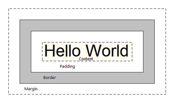
| For CSS display purposes, every element in a document is considered to be a rectangular box. The appearance and position of this box can be manipulated. Each box has a content area (e.g., the text, image etc) and an OPTIONAL surrounding: padding, border and margin. |
 |
Space properties and values
<!doctype html>
<html>
<head>
	<title>An Introduction to Style Sheets</title>
   	<style>
	body {
     	margin-left: 8%;
     	font-family: Arial, Helvetica, sans-serif;
   	}
    p {
    	text-indent: 2em;
    	margin-left: 10%;
    	margin-right: 10%;
    	padding: 2em;
    	border-color: red;
    	border-style: groove;
    	border-width: thick;
    	text-align:justify;
    	text-transform:capitalize;
    	line-height:16pt;
    }
    </style>
</head>
<body>
<span> test1 text2 </span>
<div>text1  text2 </div>
<p>
	Some text.  Some text.  Some text.  Some text.  Some text.
	Some text.  Some text.  Some text.  Some text.  Some text.
	Some text.  Some text.  Some text.  Some text.  Some text.
	Some text.  Some text.  Some text.  Some text.  Some text.
	Some text.  Some text.  Some text.  Some text.  Some text.
	Some text.
</p>

<p>
	Some more text. Some more text.Some more text.Some more text.
	Some more text.Some more text.Some more text.Some more text.
	Some more text.Some more text.Some more text.Some more text.
	Some more text.Some more text.Some more text.Some more text.
	Some more text. Some more text.Some more text.Some more text.
</p>
<body>
<html>| margin | outer wrapping of box. The margin is transparent. Shorthand - one value specifies all four sides:
The four sides are Top, Right, Bottom, Left (Use the mnemonic TRouBLe to remember order). |
|
|---|---|---|
| border-color | sets the colour of an element's border. | |
| border-style | sets the appearance of an element's border. Border-style values: solid, dotted, dashed, double, groove, ridge, inset and outset.
|
|
| border-width | sets the thickness of an element's border. Value can be thin, medium, thick or absolute or percentage value. | |
| border | Useful border shortcut - to specify width, style and colour in one line:
|
|
| padding | space between content of element & border. Inherits background (e.g., colour ) of element. Shorthand - one value specifies all four sides.
|
|
| Other properties: | ||
| line-height | sets the height of a line of text. Value can be a length or percentage of the current font-size or a point size. | |
Styling Tables
CSS can also be used to modify the rendering of tables:<!doctype html>
<html>
<head>
<title>An Introduction to Style Sheets</title>
<style>
table {
border-collapse: collapse;
border: 5px solid yellow;
}
td {
border: 1px solid red;
padding: 1em;
}
td.dashed-blue  { border: 5px dashed blue; }
td.solid-green { border: 5px solid green; }
</style>
</head>
<body>
<table>
<tr>
<td> 1 </td>
<td> 2 </td>
<td> 3 </td>
</tr>
<tr>
<td> 4 </td>
<td class="dashed-blue"> 5 </td>
<td class="solid-green"> 6 </td>
</tr>
<tr>
<td> 7 </td>
<td> 8 </td>
<td> 9 </td>
</tr>
<tr>
<td> 10 </td>
<td> 11 </td>
<td> 12 </td>
</tr>
<tr>
<td> 13 </td>
<td> 14 </td>
<td> 15 </td>
</tr>
</table>
</body>
</html>The above shows how to define CSS classes.
td.dashed-blue { border: 5px dashed blue; }
td.solid-green { border: 5px solid green; }<td class="dashed-blue"> 5 </td>
<td class="solid-green"> 6 </td>table { border-collapse: collapse; }- Adjacent cells collapse into a single border
table { border-collapse: separate; }- Adjacent cells have their own distinct borders (default)
Tables - another example to increase their readability - uses CSS classes
<!doctype html>
<html>
<head>
    <title>Table with CSS classes</title>
    <style>
    table {
    	border-collapse: collapse;
        border: 1px solid black;
    }
    tr.p  {
    	text-align:center;
    	background-color: #ffddff;
    }
    tr.b  {
    	text-align:center;
    	background-color: #ccffff;
    }
    </style>
</head>
<body>
<h2>Using CSS classes</h2>

<table width="80%">
<tr>
    <th>Module Name</th>
    <th>Module Code</th>
</tr>
<tr class="p">
    <td> Communications and Career Management</td>
    <td> ECSC400</td>
</tr>
<tr class="b">
    <td> Computer Systems Fundamentals</td>
    <td> ECSC404</td>
</tr>
<tr class="p">
    <td> Software Development Principles II</td>
    <td> ECSC405</td>
</tr>
<tr class="b">
    <td> Mathematics for Computing</td>
    <td> ECSC408</td>
</tr>
<tr class="p">
    <td> Information Systems</td>
    <td> ECSC411</td>
</tr>
</table>
</body>
</html>
CSS3 - Alternative Zebra Stripe Table Rows
In the following example the CSS3 pseudo-class:nth-of-type() is used to select odd and even rows. Then the first row is selected.
Alternative Zebra Stripe Table Rows<style>tr:nth-of-type(odd) { background-color: #ffddff; text-align: center; } tr:nth-of-type(even) { background-color: #ccffff; text-align: center; } tr:nth-of-type(1) { color: red; } /* for first row only */<style>
CSS3 Child Selectors
CSS3 includes specific pseudo-classes for selecting child elements. A child tag is any tag enclosed by another tag.
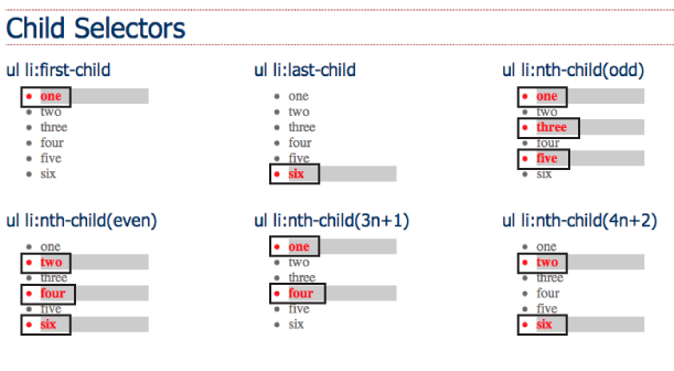
- :FIRST-CHILD Lets you select and format just the first of however many children an element may have. E.g., to select the first <h1> tag on the page, create a selector like this:
- :LAST-CHILD This is like :first-child but just with the last child of an element. E.g., to style the last item in a list, you use:
- :NTH-CHILD You can style every other row in a table, every third list item, or style any combination of alternating child elements.
h2:first-child ul li:last-child Using a keyword, either odd or even, lets you select alternating odd or even child elements. E.g., applying one background colour for each even row in a table and another background colour of each odd-numbered row:
tr:nth-child(odd) { background-color: #D9F0FF; }
tr:nth-child(even) { background-color: #FFFFFF; }
:nth-child() can also be used in another way. E.g., to highlight every third table cell inside a row, starting with the second table cell:
tr td:nth-child(3n+2) { background-color:#900; }The number before the n (3 in this case) represents which child element youâre after. So, 3n means every third element, while 4n means every fourth element.
The plus sign followed by a number (+2 in this example) indicates which element to start at, so +2 means start at the second child element, while +5 means start at the fifth child element.
So :nth-child(5n + 4) selects every fifth child element starting at the fourth child element.
CSS Positioning
The position property
The position property identifies how an element is positioned on a page.
- static
By default every element has a position value of static, which means that it exists in the normal flow of a document. The static value can be overwritten with a relative, absolute or fixed value.
.static {
  position: static;
}Setting the top, right, bottom, and left properties of a relatively-positioned element will cause it to be adjusted away from its normal position. Other content will not be adjusted to fit into any gap left by the element - there will be blank space where the relatively-positioned element would normally be.
.relative {
  position: relative;
  top: -20px;
  left: 20px;
  width: 500px;
}A fixed element is positioned relative to the viewport, the element remains fixed at the same position inside the browser window. This means it always stays in the same place even if the page is scrolled. The top, right, bottom, and left properties can be used.
.fixed {
  position: fixed;
  bottom: 0;
  right: 0;
  width: 200px;
}Taken out of the normal document flow. An element positioned with absolute is positioned relative to the nearest positioned parent. If an absolutely-positioned element doesnât have any parent elements, then the initial document <html> will be its parent.
.absolute {
  position: absolute;
  top: 120px;
  right: 0;
  width: 300px;
  height: 200px;
}When an absolute positioned element is nested inside another element which also has some position value set, then the element with the position : absolute is positioned absolutely inside the parent element.
#outerDiv {
      position: relative;
  /*  top     : 0px;
      left    : 0px;  */
      border  : 1px solid #ccc;
      padding : 10px;
  }

  #innerDiv {
      position: absolute;
      top     : 0px;
      right   : 0px;
      padding : 10px;
      background-color: #ccffcc;
      border  : 1px solid #99cc99;
}The z-index property specifies the stack order of a positioned element using integer values (positive or negative). The element with the highest z-index value will be at the foreground, while the element with the lowest z-index value will be at the back.
In this example, element1 will overlap element2 as it has the highest z-index value
.element1 {
position: absolute;
z-index: 1;
}

.element2 {
position: absolute;
z-index: -1;
}
Making elements Float
We will look at two common uses for CSS float:
- Images - We can float an image left or right allowing text and/or other elements to wrap around it.
- Layouts - We can also use float as a technique to achieve multicolumn layouts.
float can be set as either left, right or none (default). E.g.:
float:leftSlides the element to the left while content below wraps around the right side of the element.float:rightSlides the element to the right while content below wraps around the left side of the element.
Floating images
We can use float to move an image either left or right. This will allow the text to flow to the side of the floated element. The following shows how an image can be floated.
<!doctype html>
<html>
<head>
	<title>float and images</title>
</head>
<body>
<h2>Example 1 - image without float (default). </h2>
<p>
	<img src="image_f.gif" alt="non-floated image">
	Some text to wrap around the image. Some text to wrap around the image.
	Some text to wrap around the image. Some text to wrap around the image.
	Some text to wrap around the image. Some text to wrap around the image.
	Some text to wrap around the image. Some text to wrap around the image.
	Some text to wrap around the image. Some text to wrap around the image.
	Some text to wrap around the image. Some text to wrap around the image.
</p>
<hr>
<h2>Example 2 - image with style float:right.</h2>
<p>
	<img src="image_f.gif" alt="float right image" style="float:right;">
	Some text to wrap around the image. Some text to wrap around the image.
	Some text to wrap around the image. Some text to wrap around the image.
	Some text to wrap around the image. Some text to wrap around the image.
	Some text to wrap around the image. Some text to wrap around the image.
	Some text to wrap around the image. Some text to wrap around the image.
	Some text to wrap around the image. Some text to wrap around the image.
</p>
<hr>
<h2>Example 3 - An image with style float:left.</h2>
<p>
	<img src="image_f.gif" alt="float left image" style="float:left;">
	Some text to wrap around the image. Some text to wrap around the image.
	Some text to wrap around the image. Some text to wrap around the image.
	Some text to wrap around the image. Some text to wrap around the image.
	Some text to wrap around the image. Some text to wrap around the image.
	Some text to wrap around the image. Some text to wrap around the image.
	Some text to wrap around the image. Some text to wrap around the image.
</p>
</body>
</html>
Float and html forms
We can add CSS float styles to the label tag to improve the form alignment/display.
Float and layouts
When using CSS float for layouts it is common to float a block-level element such as <div> (or one of the HTML5 new elements like article, section, aside). The floated elements will require a width.
<!doctype html>
<html>
<head>
	<title>CSS floated columns</title>
	<style>

    #header {
       	font-size: 2em;
	    text-align: center;
        border: solid 2px blue;
        color: blue;
    }

    #column1 {
		float: left;
		width: 40%;
    }

    #column2 {
		float: left;
		width: 60%;
	}
</style>
</head>

<body>
<div id="header">
	<p>Using float to create column layout</p>
</div>

<div id="column1">
	<h2>Column 1</h2>
	<p>
	Some content for the column.  Some content for the column.
	Some content for the column.  Some content for the column.
	Some content for the column.  Some content for the column.
	Some content for the column.  Some content for the column.
	</p>
</div>

<div id="column2">
	<h2>Column 2</h2>
	<p>
	Some content for the column.  Some content for the column.
	Some content for the column.  Some content for the column.
	Some content for the column.  Some content for the column.
	Some content for the column.  Some content for the column.
	</p>
</div>

</body>
</html>
Layout approaches:
- using percentages for the widths creates a fluid (or liquid) layout that skrinks and expands depending on the size of the browser window.
- fixed layouts use pixel-based widths - the layout does not change when viewed on smaller/larger devices.
What happens if we add some padding to each column?:
#column1 {
	float: left;
	width: 40%;
	padding: 2%;}

#column2 {
	float: left;
	width: 60%;
	padding: 2%;
}
Example shows float drop - one column has dropped down. Why â because there is not enough room for the column. Note: the width of an element displayed in the browser window is not the same as its width property.
The displayed width of any element is a combination of its width, left and right border sizes, left and right padding and left and right margins.
- Width of Column 1 = 40% plus left padding (2%) plus right padding (2%) = 44%
- Width of Column 2 = 60% plus left padding (2%) plus right padding (2%) = 64%
For the columns to fit the browser window / containing block must accommodate the combined total of all these widths. How can we solve this?
Solution 1 - Reduce column widths:- Column 1 = 36% plus left padding (2%) plus right padding (2%) = 40%
- Column 2 = 56% plus left padding (2%) plus right padding (2%) = 60%
Solution 2 - Use CSS3 box-sizing property. This includes the width and any paddings and borders within the width of the column (reduces the column width). Need prefix for Firefox.
    { -moz-box-sizing:border-box;  /* for Firefox */
box-sizing:border-box; /* for other browsers */ }clear property
As we know, with CSS float an element can be pushed to the left or right, allowing other elements to wrap around it.
The CSS clear property instructs an element to not wrap around a floated element. By clearing an element you can force it to drop down below the floated item.
You have three options - clear:left; clear:right; clear:both. Many people choose to use clear:both since it clears elements floated left and/or right.
Example - We add the following footer to the web page:
<div id="footer">
	<p>Some content for the footer.  Some content for the footer.
	Some content for the footer.  Some content for the footer.</p>
</div>#footer {
border: solid 2px blue;
color:blue;
}The results are not as expected - the footer is trying to wrap around the floated columns! We need to force the footer to drop down below the floated items by adding clear:both to the CSS:
#footer {
	border: solid 2px blue;
	color: blue;
	clear:both;
}
CSS3
The CSS3 specification is still under development. However, many of the new CSS3 properties have been implemented in modern browsers.While waiting for the CSS3 specification to become final, browser makers added (often nonstandard) features and prefixed the property names:
- Firefox uses
-moz- - Chrome uses
-webkit- - IE uses
-ms- - Opera uses
-o-
border-radius
To specify rounded corners to rectangular shapes. Supported in IE9+, Firefox 4+, Chrome, Safari 5+, and Opera. To round all four corners equally:border-radius: 20px;Example border-radius with vendor prefix
#radiusBorder { border:2px solid blue; padding: 30px; width: 275px; -moz-border-radius: 20px; /* Old Firefox */ border-radius: 20px; /* for current browsers */ }<div id="radiusBorder"> If supported the browser will display this as a box with rounded corners </div>
Remember to have a border (as above) or a background colour (as below) so that the rounded corners can be seen.
#radiusBG { background: aqua; padding: 30px; width: 275px; -moz-border-radius: 20px; border-radius: 20px; /* current browsers */ }<div id="radiusBG"> If supported the browser will display this as a box with rounded corners </div>
box-shadow
To implement multiple drop shadows on box elements, specifying values for size of offset blur and colour.box-shadow: 10px 10px 5px #888;inset keyword creates an inner shadow.
Example box-shadow with vendor prefixes
#bs { width: 300px; height: 100px; background-color: lightblue; -moz-box-shadow: 10px 10px 5px #888888; /* Old Firefox */ box-shadow: 10px 10px 5px #888888; padding: 10px; }<div id="bs"> If supported the browser will display a box with box-shadow </div>
text-shadow
The text-shadow property applies shadow to text. Accepts offset from left, offset from top, blur distance and colour. IE does not support the text-shadow property.<h1 style="text-shadow: 3px 3px 1px #888;">
If supported the browser will display this with text shadow
</h1>